Home | Product Design | Responsive Website
Designing an intuitive solar comparison system to bridge the gap between curiosity and commitment

TL;DR
I joined the solar project mid-flight to conduct a comprehensive UX audit of the initial prototype and identify critical barriers to conversion. By realigning the journey with high-trust UX patterns and consolidating the fragmented booking flow, I transformed a brand-new 0-to-1 vertical into a high-intent lead engine that bridges the gap between solar curiosity and expert consultations.
Let me see the designs already! >
Role: Product Designer
Working alongside a team of product designers,product managers, analyists and content designers, my role on this project was:
UX Audit
UX
Strategy
UI
20% expected increase in game launch rate
The Challenge
From curiosity to commitment
As a leading price comparison platform, Uswitch recognized a growing consumer interest in renewable energy but lacked a dedicated pathway for solar adoption. The objective was to launch Uswitch’s first solar comparison journey, transforming a complex, high-consideration purchase into a clear, actionable experience.
The primary hurdle was the "curiosity gap." While interest in solar was high, the market was fragmented and intimidating. Users faced "comparison fatigue" from manual research and a deep-seated distrust of industry "cowboys."
We needed to build a system that could consolidate these disparate options into a single, trustworthy source. The goal was to capture initial curiosity and provide enough clarity to convert hesitant users into confident leads for vetted solar providers.
Key Objectives
Establish a "Trust Layer"
Build credibility within a brand-new category to alleviate user fears regarding industry scammers.
Consolidate the Journey
Replace fragmented research with a single, intuitive comparison flow.
Bridge the Curiosity Gap
Design a path that converts research into scheduled expert consultations.
The Strategic Audit
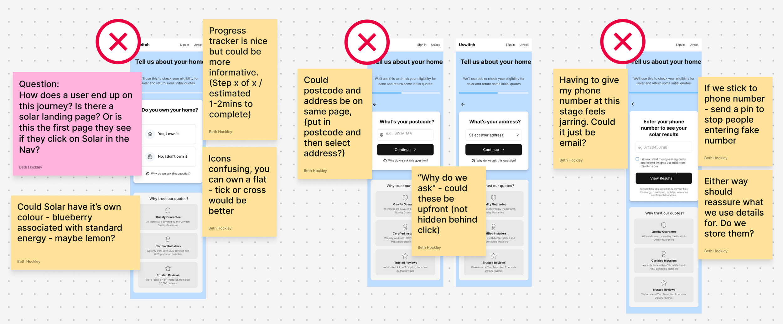
Pre-results audit: Identifying issues in the pre-results prototype
Fresh eyes on a functional prototype
I joined the project after an initial prototype had been developed. My first step was to to conduct a comprehensive audit of the initial end-to-end prototype. While the foundation was functional, my "fresh eyes" review identified over 15 critical friction points where the user experience felt disconnected, jarring, without the clear hierarchy needed to move a user from "just looking" to booking a consultation.
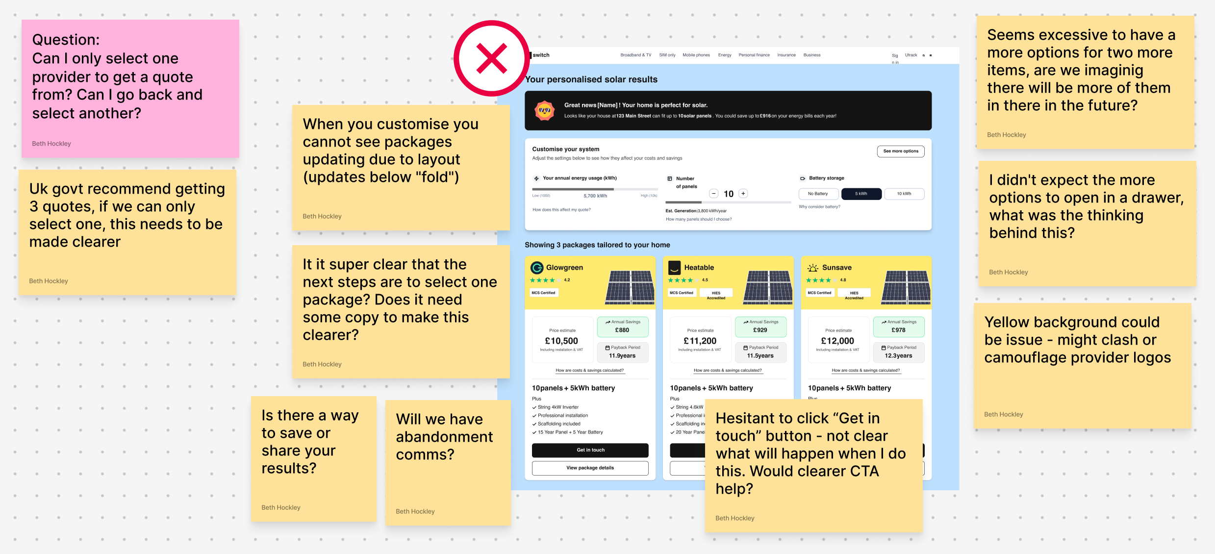
Results audit: Identifying issues in the results prototype
Recommendations provided:
Optimising the "Data-Value Exchange": I flagged that requiring a phone number early felt "jarring." I advocated for a transparent data strategy and email-first options to protect lead quality.
Improving Visual Feedback Loops: I identified that customization was happening "below the fold." I restructured the layout to ensure results updated in the user’s immediate field of view.
Psychological Reassurance: I identified that the "What Happens Next" guidance was buried at the bottom of the booking flow. I recommended moving this upfront to lower anxiety before asking for a commitment.
Establishing a Distinct "Solar" Identity: I proposed moving away from standard energy blue to a "Solar Lemon" palette, giving the vertical a distinct personality while maintaining platform authority.
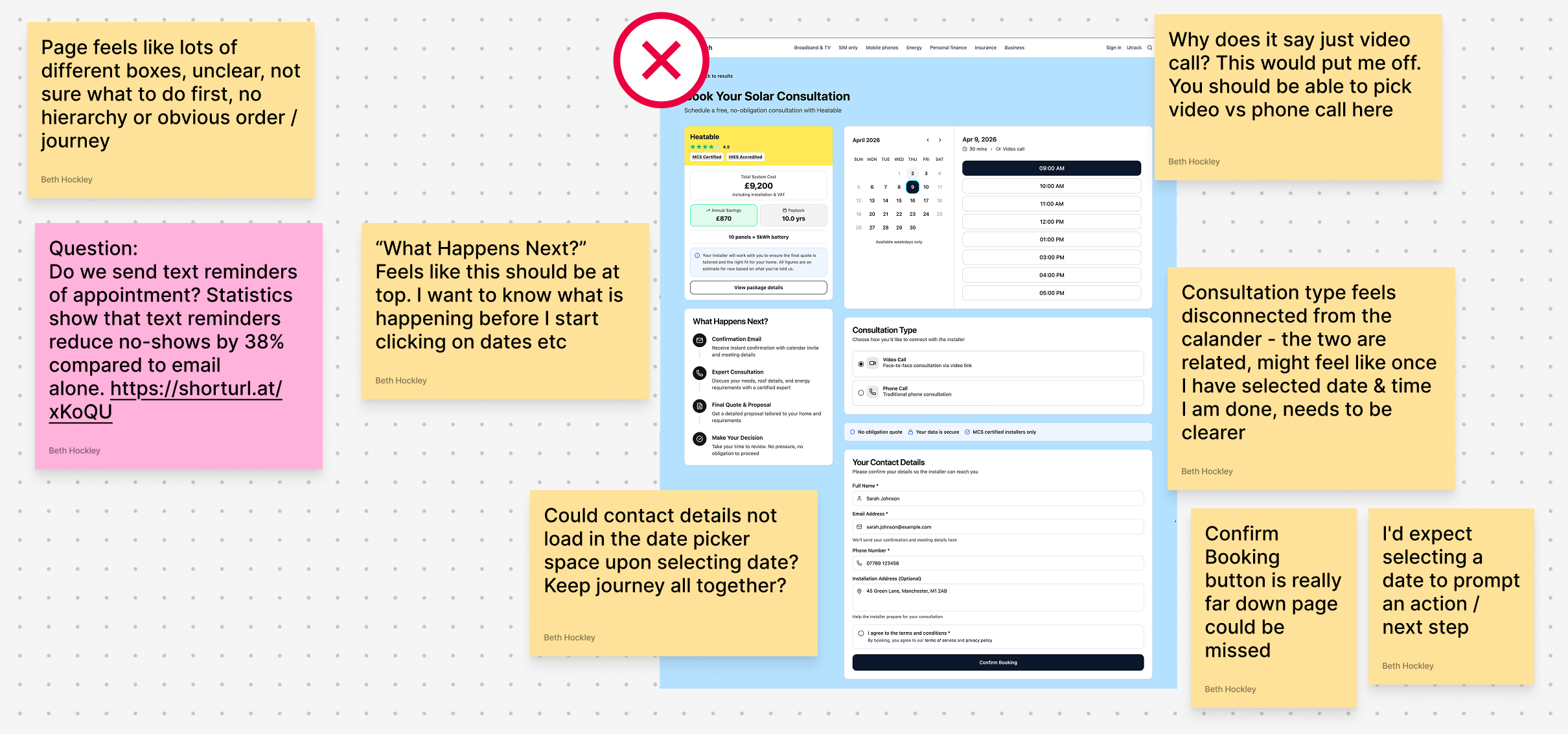
Booking audit: Identifying issues in the booking prototype
My three-pronged visual strategy was:
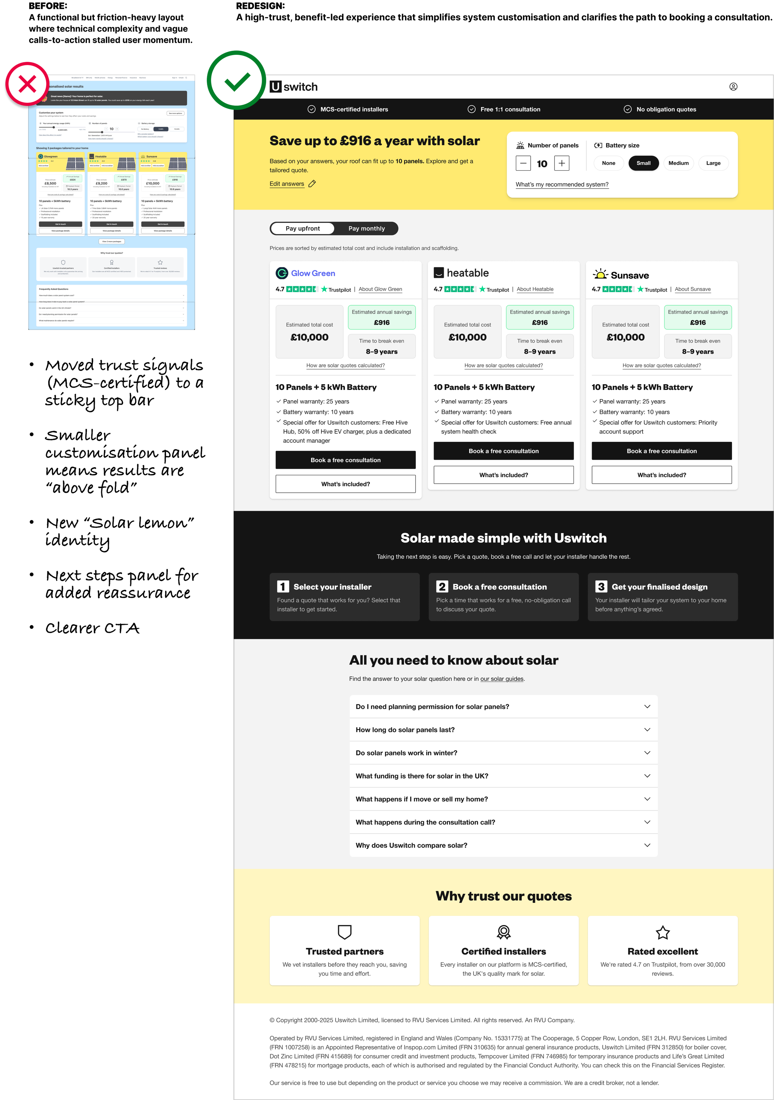
1. Elevating Trust & Benefits: As seen in the "After" (right), I replaced the technical sliders at the top with a 'Solar Lemon' header. This header immediately addresses user anxiety by prioritising the personal value proposition (e.g., "Save up to £916") and displaying persistent "MCS-certified" trust badges.
2. Fixing Visual Feedback Loops: I moved the simplified customisation inputs (panels and battery) into the new header. This ensures that when a user makes a change, the results are updating in their immediate field of view, solving the "below the fold" feedback issue from the prototype.
3. Architecture for Persuasion: I replaced the dense technical tables with a more scannable layout. I introduced the "Solar Made Simple" 1-2-3 roadmap to demystify the next steps and changed the vague "Get in touch" CTA to "Book a free consultation", transforming the entire page from an information dump into a persuasive conversion funnel.
The Solution
Anchoring complexity in context and trust
The final results experience transformed a "numbers-first" functional page into a benefit-led conversion engine. My redesign focused on restructuring the entire page hierarchy to solve two core problems identified in the audit: high cognitive load and a severe lack of trust signals.
My three-pronged visual strategy was:
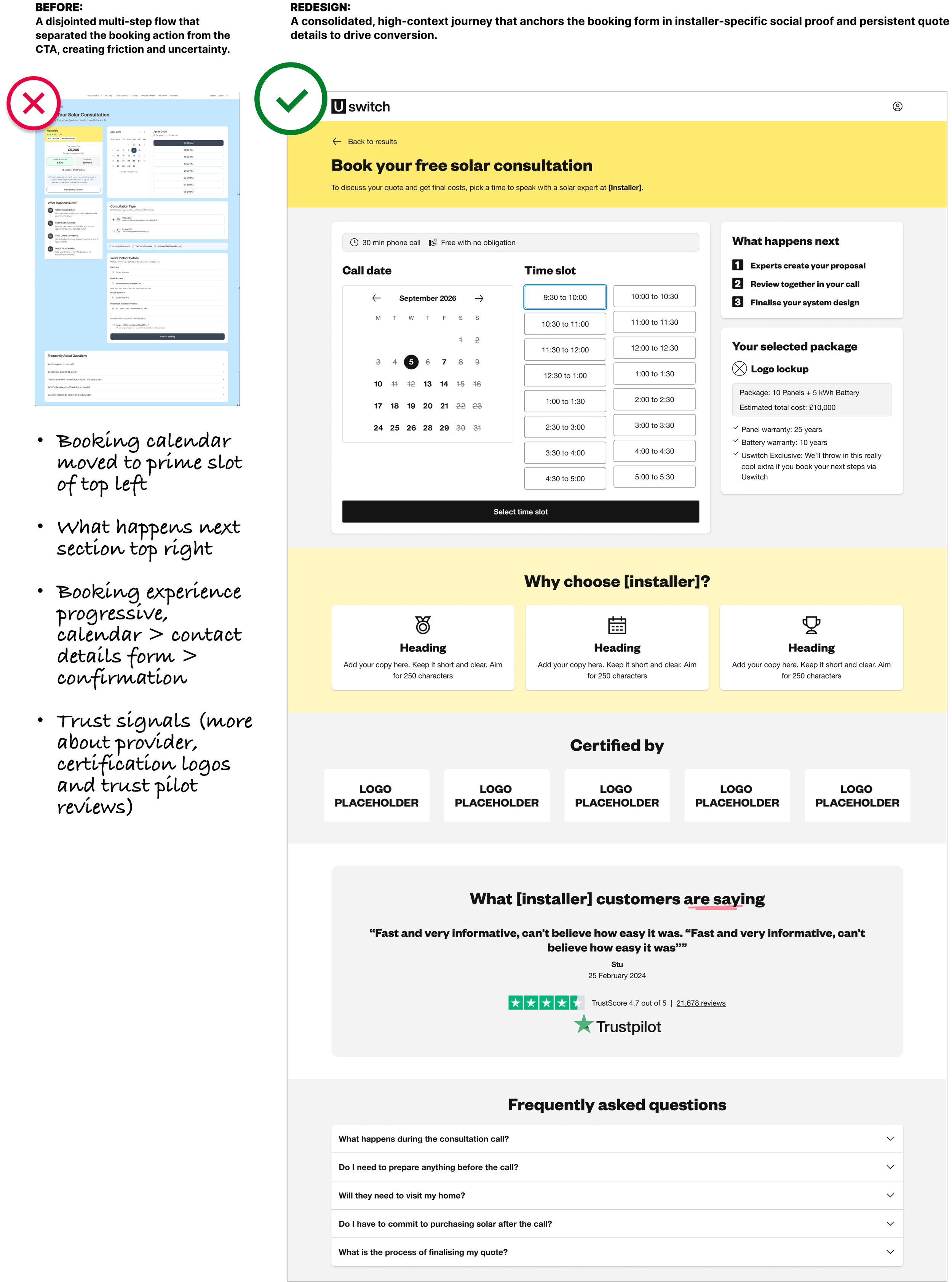
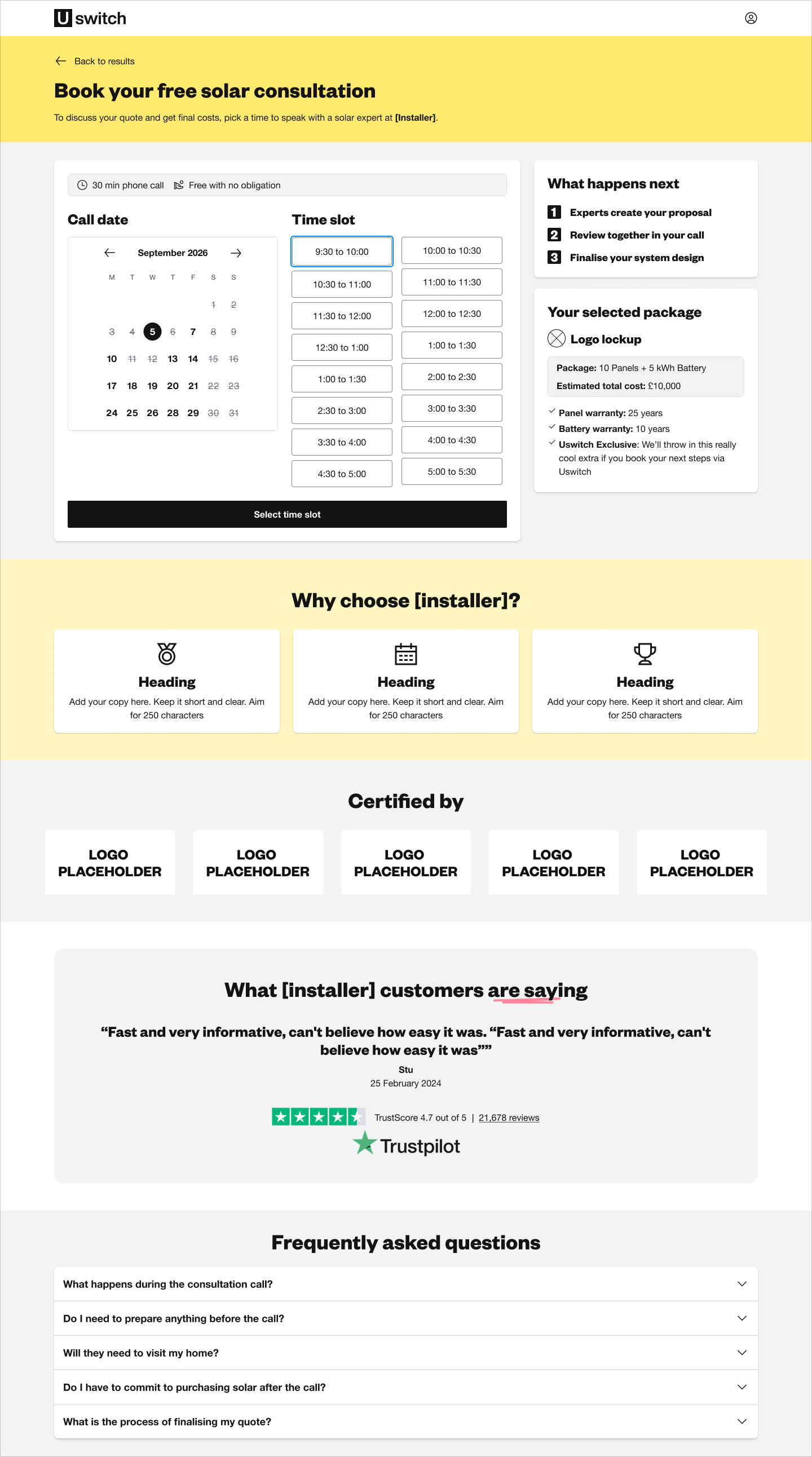
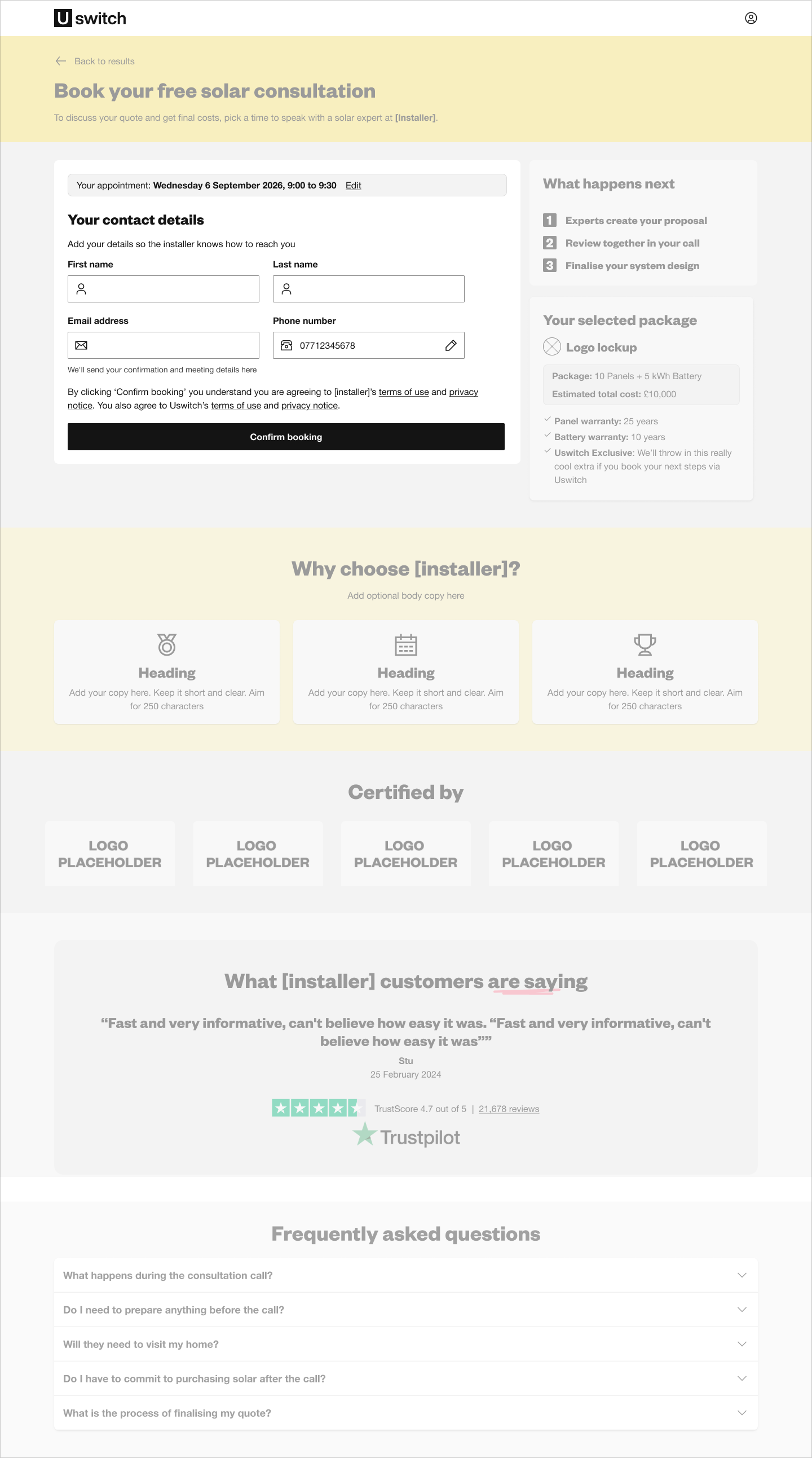
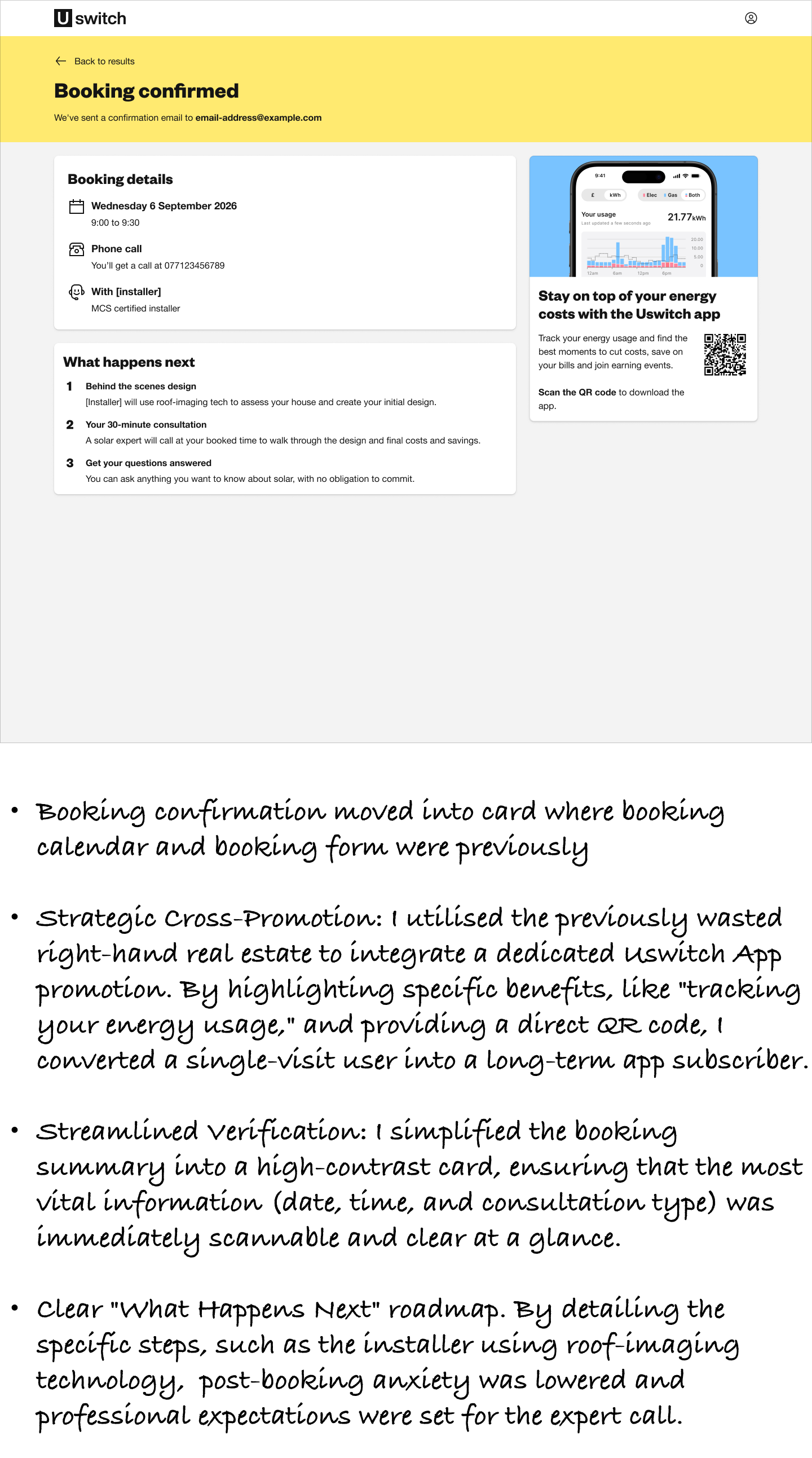
1. Frictionless In-Place Transitions: I replaced the disjointed multi-page journey with a single-container "state change." By having the contact form load directly into the space previously occupied by the calendar, I maintained the user's focus and reduced the cognitive load associated with full-page refreshes.
2. Optimised Contextual Reassurance: While the initial prototype included a sidebar, I restructured it to prioritize the specific Uswitch Exclusive benefits and installer specs. This kept the "Value Proposition" pinned to the screen, ensuring users felt rewarded for their choice while entering personal data.
3. The Trust Barrier (Social Proof): I introduced a comprehensive trust layer beneath the booking action. By integrating installer-specific USPs, accreditation logos, and live Trustpilot ratings, I proactively addressed the "industry cowboy" fear exactly where users were most likely to drop off..
Redesigning for Commitment
(The Booking Flow)
The transition from selecting a quote to booking a consultation was the highest-friction point in the prototype. I focused on streamlining the interaction model and injecting "Social Proof" to bridge the final trust gap.
Booking Designs - Mobile


Booking Designs - Desktop
Results & Impact:
Turning curiosity into a new business vertical
The launch successfully established solar as a high-performing new revenue stream for Uswitch. By transforming a functional prototype into a trust-led, persuasive journey, we created a holistic experience that serves both the homeowner’s need for clarity and the business’s need for high-intent lead generation.load and a severe lack of trust signals.
1. Increased Lead Quality
By addressing the "jarring" data requests identified in the audit and replacing them with a transparent, value-led booking flow, we secured higher-intent leads and reduced the volume of "fake data" entries.
2. Reduced Abandonment
Consolidating the multi-step booking flow into a single, in-place state change successfully mitigated "comparison fatigue," resulting in a significantly higher completion rate compared to initial testing phases.
3. Ecosystem Growth
By utilising previously wasted real estate on the confirmation page for app cross-promotion, we successfully turned a single-visit "solar lead" into a long-term Uswitch app user.
4. Scalable Design Blueprint
The "Solar Lemon" identity and the high-trust UI modules I developed created the strategic blueprint for future renewable energy verticals across the Uswitch platform.
This project reinforced that in high-consideration markets like renewable energy, clarity is just as important as conversion. By joining mid-flight to stress-test the prototype against user skepticism, I proved that a 'trust-first' architecture, one that prioritises proactive reassurance and transparent data exchanges, is the most effective way to turn a complex 0-to-1 vertical into a scalable lead engine.”