Home | Product Design | Native App
Designing a Modern, Multi-Brand Lobby for the Global Poker Market
TL;DR
To address critical friction in the lobby-to-table journey, I developed a 'Shop Window' strategy and a modular navigation system. This design-led initiative transformed the app from a closed registration wall to an open browsing experience, securing stakeholder buy-in to use the new framework as the official blueprint for the global Entain brand family.
Let me see the designs already! >
Role: Product Designer
Working alongside a team of product designers, product managers, analysts and engineers, my role on this project was:
UX
Strategy
UI
Design System
The Challenge
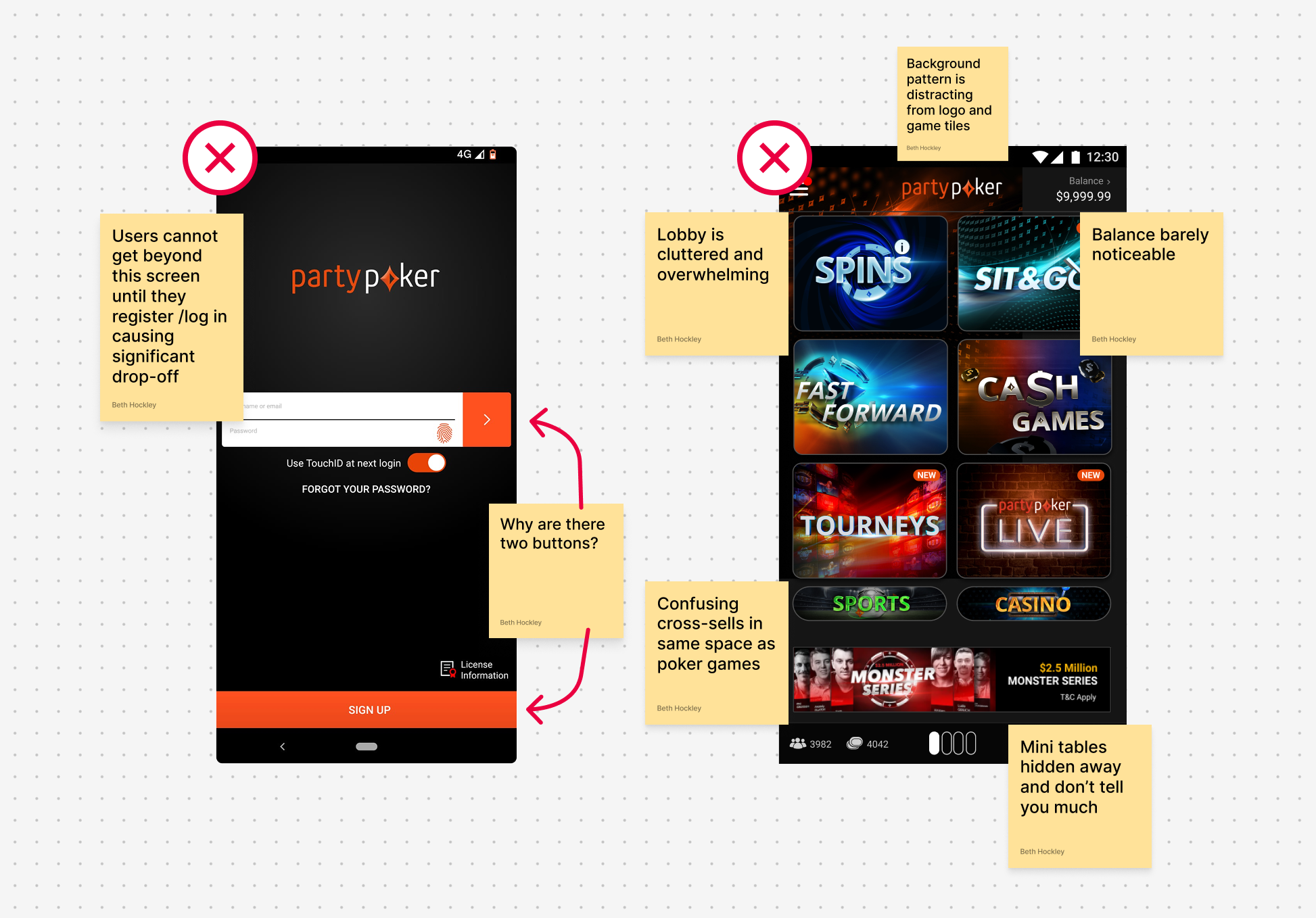
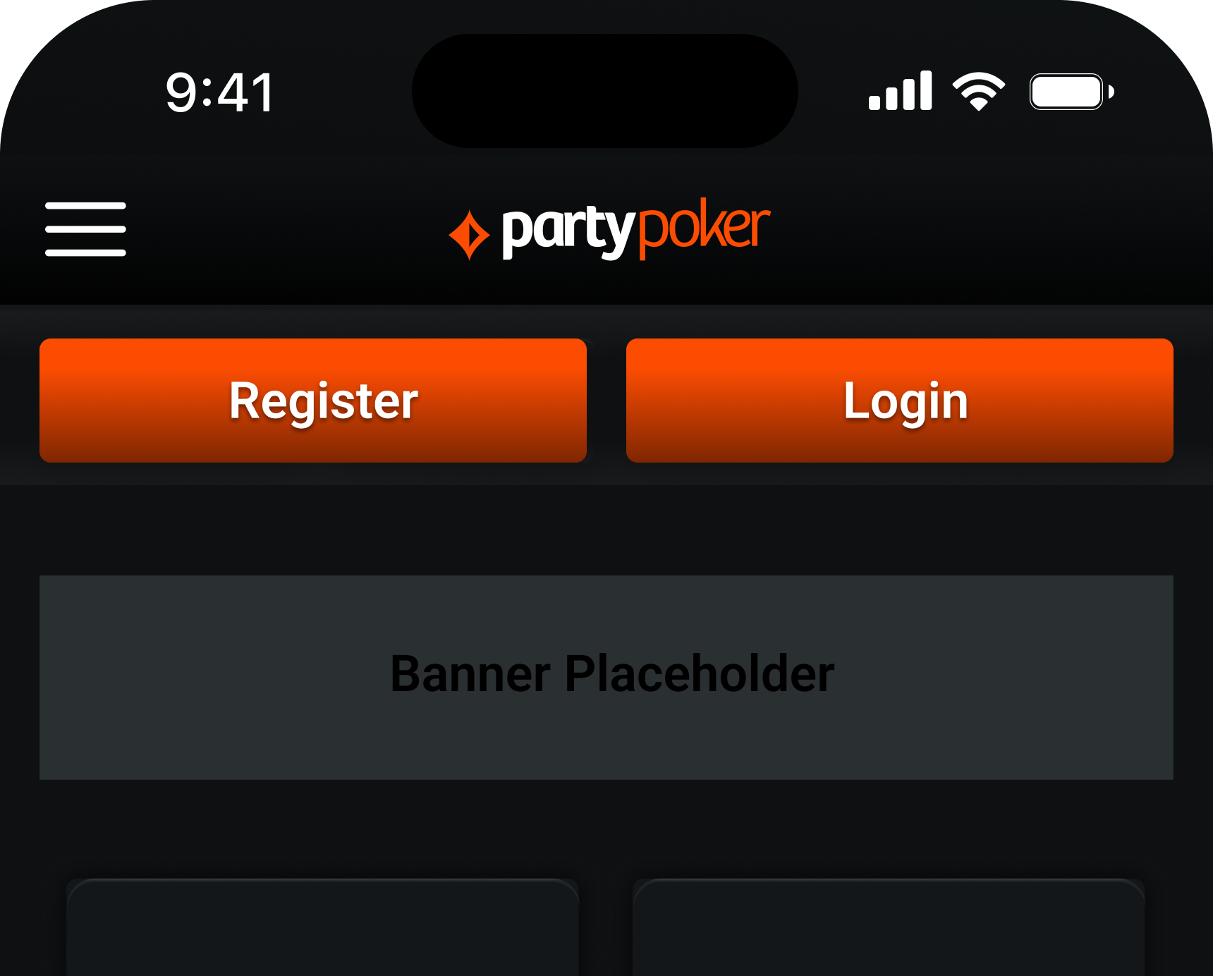
The legacy partypoker app functioned like a "black box." New users were met with a rigid registration wall before seeing a single game, leading to significant drop-off at the front door. For existing users, the lobby was cluttered and overwhelming, making it difficult to find core utilities like their balance, inbox, or active tournaments.
Key Objectives
To guide the redesign, we established four primary pillars of success:
Conversion:
Reduce registration-wall bounce rates by implementing a "Guest-Access" lobby.
Engagement:
Decrease "Time to Play" by introducing persistent navigation and mini-table shortcuts for seamless jumping between the lobby and live play.
Discoverability:
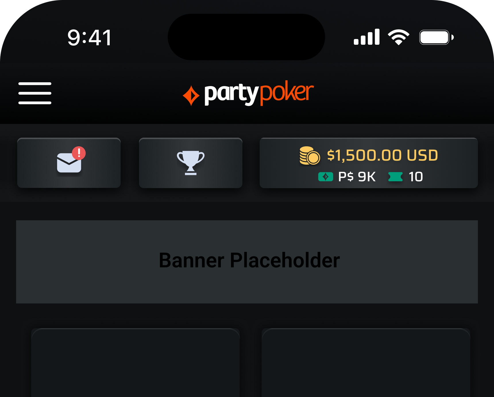
Surface critical user data (Balance, Inbox, Tourneys) to reduce support queries and friction.
Scalability:
Develop a "White-Label" framework that supports 5+ global brands and seamlessly integrates cross-sell opportunities for Casino and Sports products.
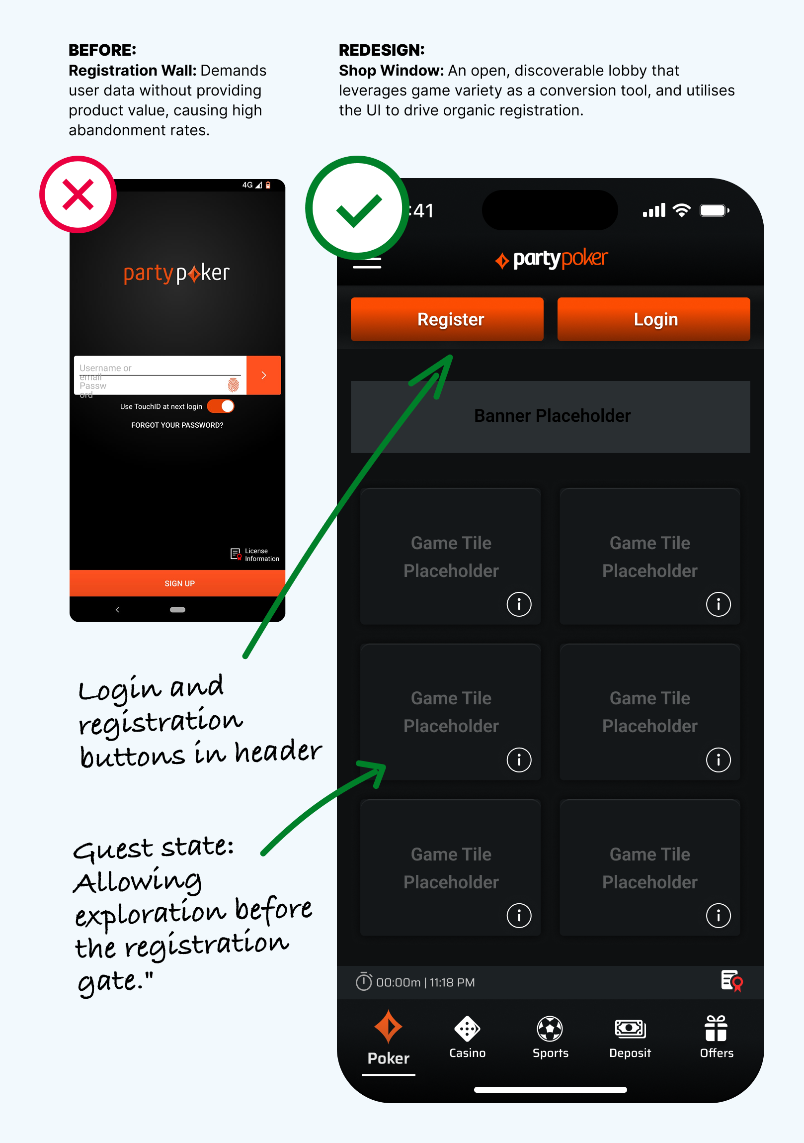
Strategic Shift: From "Gatekeeping" to "Showcasing"
We flipped the traditional user flow, replacing a mandatory sign-up wall with a discoverable "Shop Window" experience. Our mantra for the redesign was:


Show the game, then sell the seat.”
“
Open Browsing: New users can now explore game tiles and app features immediately upon launch.
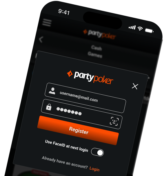
Just-in-Time Conversion: High-visibility CTAs were integrated into the header, only triggering the registration gate at the moment of highest intent: joining a game.
Marketing as UX: By utilising a modular tile architecture, the UI functions as a self-serving "shop window." I designed the lobby as a flexible framework, allowing the marketing team to dynamically populate game tiles and featured banners while maintaining a consistent user experience.
Rather than a hard redirect, the register flow is triggered as a contextual overlay when a guest attempts to join a game. This maintains the user's place in the lobby while introducing modern, low-friction entry points like FaceID.
Product Architecture
The Adaptive Header
To maintain brand consistency and player utility, we developed a persistent, state-aware header that serves as a central hub for the user journey.
Contextual States:
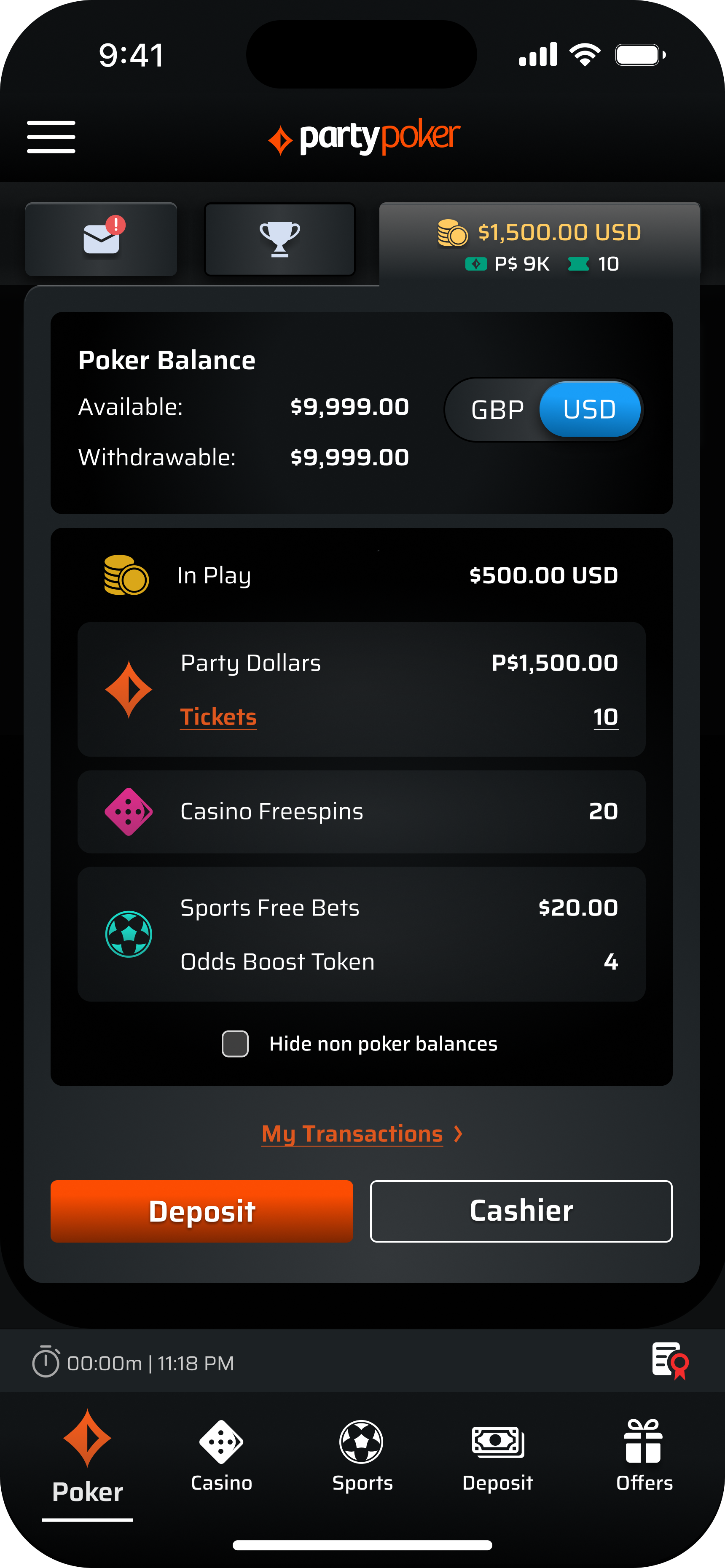
The header transitions dynamically based on user status. It serves as an acquisition tool in Guest Mode (Registration/Login) and evolves into a high-utility dashboard for authenticated players (Inbox, Tourneys, Balance).
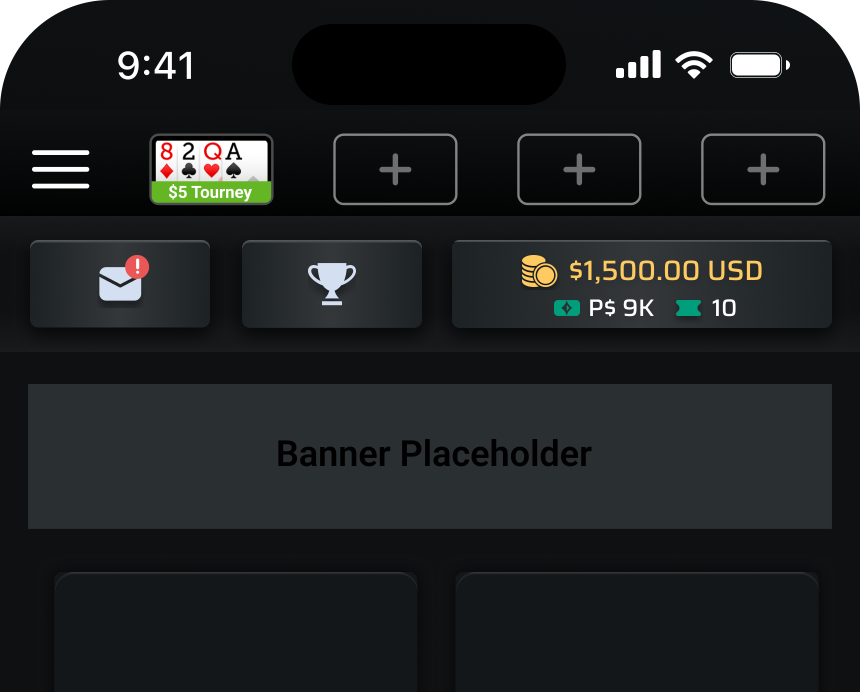
Mini-Table Integration:
To solve the friction of "game-loss" during navigation, we utilized the persistent header space for live Mini-Tables. These real-time snapshots replace the brand logo during active sessions, providing a frictionless "jump-back" to live gameplay.
Looking Ahead: V2.0 & Personalisation
While the initial launch focused on the core architecture, we designed the system to be "future-proof."
Identity & Personalisation:
To enhance the personal experience, we suggested that users be given the option to choose their own avatar.
The Scrollable Feed:
Moving beyond static tiles to a rich, scrollable lobby featuring cashback rewards, blog content, and social updates.
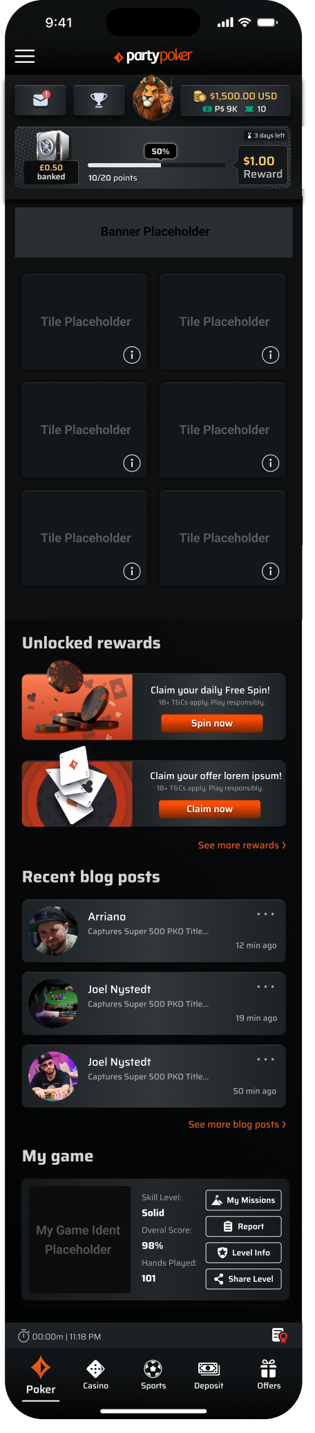
Direct Balance Access:
A proposed tabbed balance panel that overlays the lobby, providing a faster way to manage funds without leaving the current screen.
The Impact: The Blueprint for Global Scale
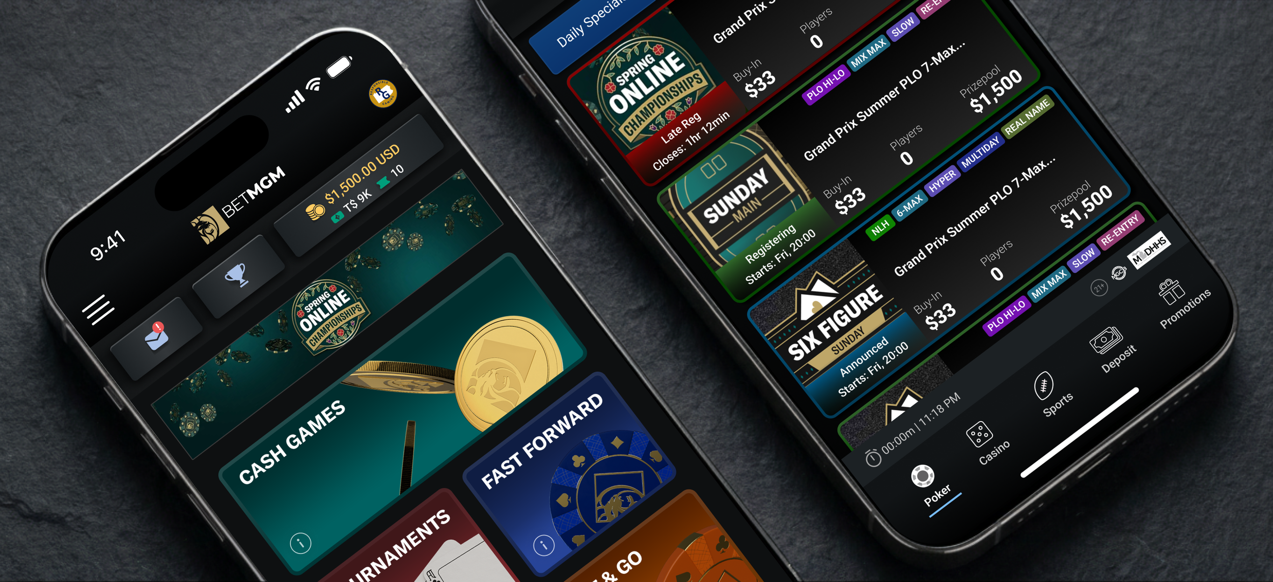
Following the success of the partypoker redesign, I executed the design rollout for Coral, Ladbrokes, BetMGM, Borgata, and Bwin.
I ensured each brand maintained its unique identity while benefiting from a unified, high-performance architecture. This framework now serves as the foundation for millions of players within the Entain ecosystem worldwide.
This project reinforced the value of designing for scalability from day one. By building a modular framework that solved the most complex navigation and 'Shop Window' logic first, we created a high-performance system that was robust enough to be seamlessly rolled out across the Entain global portfolio.”